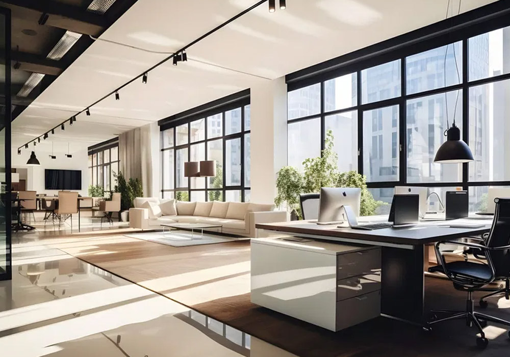
When entering a corporate headquarters, the industry can typically be inferred within ten seconds. Glass, white walls, and a single potted fig can mean tech or advertising. Dark wood, brass fixtures, and a boardroom the size of a small ballroom can mean law, finance, or the presence of a company with a hundred-year-old name on the door. Neither aesthetic is inherently good or bad. Both work perfectly when chosen with intention, and both do not work when chosen out of routine, rather than strategy.
What we actually mean by minimalism and tradition
What makes an office minimalist isn’t simply “is there less of it?” but rather an adherence to a few simple but all-encompassing tenets. Most notably, minimalism is an active attempt to reject excessive ornamentation and decoration in favor of simplicity – the difference, of course, being in the eye of the beholder. However, minimalism doesn’t end with just the styling; it’s also about functionalism and efficiency.
Traditional design runs the opposite direction. It’s rich hardwoods, symmetry, molding, leather upholstery, desks with real heft and visible joinery. It says permanence. It says this company has been here a while and plans to stay. Where minimalism whispers, tradition speaks at a normal volume and expects you to listen. Both are legitimate design languages. The mistake is assuming one is inherently more “current” than the other.
The lazy binary that trips up decision-makers
A partnership looking to signal competence and trust to clients can’t just slide a steel table into a sterile white room and call it a day. And steel tables on white floors (or still worse, white carpets) are their own sort of signaling, just not the one most firms should want to project.
Every design decision is a signal, either to potential clients, employees, or business partners. No one will see the office sketch, the Excel sheet with funding details, or the size of the Forerunner order; they’ll see what’s in the office arrayed before them, and they’ll draw inferences from it. Minimalism done poorly doesn’t look sophisticated. It looks cheap and unfinished, like a space that ran out of budget halfway through the build-out. Meanwhile, traditional design executed with care conveys stability and craft in a way that no amount of white paint can fake. The failure mode isn’t the aesthetic itself. It’s applying either one without thought.
Brand identity shapes the choice, but don’t let it choose for you
That’s right, the physical space your company occupies is more than just a convenient place to work and meet. An office or headquarters says something about what you do and why you do it (or what you wish you did and why you wish you did it). You don’t need to go out of your way to make it edgy or even novel. You just have to make sure that what you’re saying is exactly what you want to be saying.
But clichéd alignment is its own risk. A 200-year-old insurance company that leans hard into traditional design because “that’s what insurance companies look like” ends up indistinguishable from every competitor on the same street. A fintech startup that fills its office with the exact same blonde-wood minimalism as every other funded startup in the building isn’t making a statement, it’s following a template. The strongest headquarters designs use the aesthetic language of their industry as a starting point, then deviate somewhere deliberate enough to be memorable.
The psychology backs both sides, which is exactly the problem
Environmental psychology provides evidence to support both arguments. A 2011 study by the Princeton Neuroscience Institute found that visual clutter in a physical environment competes for the brain’s attention, measurably reducing focus and performance on cognitive tasks (McMains & Kastner, Journal of Neuroscience). This is the scientific underpinning of the entire minimalist case for office design. Fewer visual competitors mean more available attention for actual work.
Yet, on the other side, much research on biophilic design and natural materials suggests that warm textures – wood grain, natural light, tactile surfaces – reduce stress and support well-being in ways that sterile, ultra-clean environments simply do not. A room stripped down to the bare essentials may indeed reduce clutter-driven distraction but can simultaneously feel cold and depleting in its own way. Neither camp has a monopoly on the evidence. The real answer is that clutter is the enemy, not warmth, and you can have warmth without clutter.
Hybrid work changed what the headquarters has to accomplish
Before working from home was common, the office was the only game in town. Now it rivals the quiet kitchen table and the coffee maker that plays jazz. If the office isn’t better than home, people stay put.
The same is true for aesthetics. The minimal office that is minimal only for the sake of as few things as possible (rows of same standing desks, no texture, no personality) loses to home. The old-timey office that is formal for the sake of formality without any comfort in the mix loses to home. The winner is the design that most makes people feel like taking a shower and getting dressed was worth it, and that’s almost always the one with the most natural light, the most tactilely pleasant elements, the most room for quiet/focus and presumably the most room for the kind of casual “collaboration” that Zoom still hasn’t been able to replicate. Activity-based working models that make employees the masters of their own layout fate have rendered stark floor plans less interesting no matter which aesthetic you foist on top of them.
The executive office is where the philosophy becomes real
All design conversations inevitably lead to one room: the executive suite. It is the most public, most emblematic space in the building, and it’s typically where the entire design argument is won or lost on a small scale.
Here’s a move that works better than throwing in all the way with one side or the other: design the architecture minimalist – clean walls, quiet palette, uncluttered sightlines – and then plug in one big, solid old piece in the middle of the room. A well-chosen executive desk can do this for you. It’s the thing that gives the room hierarchy and a feeling of permanence, of not changing out the furniture every four years just because it’s starting to look dated but without having to make the rest of the room all the way traditional.
The desk, when you do this, becomes the one object in the room that makes assertions about the person on the other side of it and the rest of the room goes quiet to underscore that. It’s not competing. This isn’t a stance taken out of wishy-washy dithering. It’s using contrast intentionally – showing constraint everywhere except at the one spot that tells people weight and drive and craft actually matter. You don’t have to let the desk dominate, either. Surround the desk with minimal furniture.
Space, budget, and the real cost of “timeless”
Open-plan layouts and tighter square footage per employee – a trend that’s only intensified as companies right-size their real estate post-hybrid – naturally favor minimalism. That downsizing usually means an actual move to a new address, and companies leaning on corporate office movers for the transition find a minimalist footprint far simpler to pack, transport, and reset than a floor full of oversized traditional casegoods. Clean lines and low-profile furniture make small footprints feel less cramped, and neutral palettes are cheaper to execute at scale.
True traditional casegoods are a different investment entirely. Solid wood furniture with hand-finishing takes more square footage to look right and costs considerably more upfront than laminate or veneer alternatives. The trade-off is longevity. A well-built traditional desk can outlast three redesigns, while budget minimalist furniture built for a trend cycle often needs replacing within a decade. Sustainability considerations – FSC-certified wood, low-VOC finishes – matter in both categories now, but they’re easier to verify and market around in traditional, materials-forward furniture.
Ergonomics doesn’t care which aesthetic you picked
No matter if a desk is brand new or 40 years old, setting up at a fixed 30” high bench for 8 hours a day will cause some people mild discomfort and others lifelong pain. With general guidelines coalescing around the 28-30″ (71-76 cm) height range for seated work and 44-48″ (112-122 cm) range for standing work, that elusive perfect desk that can accommodate both an average PC user and a 6′ 5″ VR developer isn’t much taller than an average dining table – except you can’t simply rest your arms on it to type or stare down at newsprint on it for long hours of reading. Designing a table height work surface that’s functionally comfortable for a broad population of shapes, sizes, and preferences is difficult, but it can’t be treated as an afterthought by product developers any longer.
Why “transitional” is the smartest headquarters strategy
For many headquarters, the strongest move isn’t to be predictably maximalist or all-in on either trend. It’s to treat minimalism as a shell: a clean, modern canvas, but not the entire core of the space. Then seed in a small number of heritage-rich, traditionally crafted statement pieces that you keep and maintain for decades. A blended space will give you some of the psychological upside of minimalism – visual order, lower cognitive load, the sense that you’re part of today’s design era, and a lot more physical upside in terms of touch, comfort, and tone.
It also ages better. A fully minimalist office can feel dated the moment the next design trend arrives, since its whole identity rests on being current. A fully traditional office can feel frozen in time if nothing about it acknowledges the present. A blended space, grounded in a few well-chosen anchor pieces, has more room to evolve without a full renovation.
A five-point framework instead of a gut call
Instead of defaulting to whatever aesthetic feels right to you, score this decision against five criteria:
- Brand image – does the aesthetic reinforce what the company wants to be known for, without falling into industry cliché?
- Workforce preference – does the team skew toward valuing flexibility and openness, or formality and privacy?
- Maintenance – can facilities realistically keep a fully minimalist space looking crisp, or a traditional space looking polished, given current staffing and budget?
- Longevity – is the goal to look current for the next three years, or to look appropriate for the next twenty?
- Budget – does the upfront cost of true traditional materials make sense against the total lifespan of the furniture, versus the lower entry cost and shorter lifespan of minimalist alternatives?
Score honestly against those five, and the right answer for a given headquarters usually becomes obvious pretty fast. It’s not a pure extreme. It’s almost always some version of the transitional approach, weighted toward whichever end of the spectrum the scores favor.
The building doesn’t need to choose a side in a design argument that’s been running for decades. It needs to serve the people working in it, hold up under the practical demands of a modern workday, and say something true about the company behind it. Get those three things right, and the aesthetic question mostly answers itself.