Key Takeaways
- Card-based layouts organize content into manageable units, improving the user experience.
- They provide flexibility and seamless responsiveness across desktops, tablets, and smartphones.
- Following best practices in card design leads to greater engagement and broad accessibility.
Card-based design patterns have become a foundational aspect of modern web interfaces, presenting information in a modular, user-friendly way. By grouping content into cards, designers make websites more visually appealing and easier for users to navigate. For examples of how companies apply these principles, you can explore these card designs to see a diverse range of creative implementations.
As the digital landscape continually evolves, card-based layouts offer a practical solution for organizing complex information, supporting everything from social media feeds to product listings in e-commerce platforms. Their adaptability and intuitive structure have led to widespread adoption, making them a key trend in user interface development.
Understanding the core benefits and best practices behind card-based design is essential for crafting interfaces that not only look polished but also serve the needs of diverse users. The deliberate segmentation of content into cards mirrors tangible objects like business cards or trading cards, which naturally guide the user’s eye and interaction. This method helps break down dense information into accessible units, improving engagement and comprehension.
With so many sites leveraging this pattern, it is important to be aware of both the strengths and limitations when designing with cards. By understanding the factors that shape card design, developers and designers can better meet the needs of diverse user bases and devices.
Understanding Card-Based Design Patterns
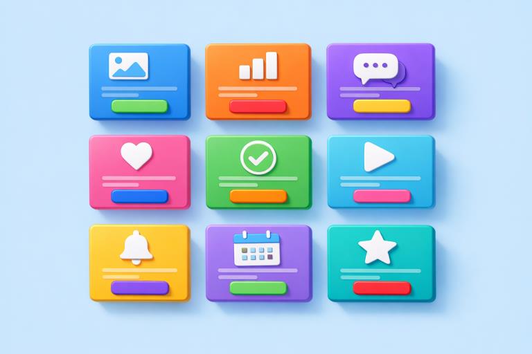
A card in web design is a rectangular or square container that encapsulates related content as a unified piece. Common elements within a card include images, headlines, concise text, and clear calls to action. The concept parallels familiar physical cards, allowing users to grasp the structure and interact naturally immediately
This design strategy leverages visual grouping, using borders, spacing, and background shades to make each card distinct while maintaining cohesion with the rest of the layout. Effective card design focuses on clarity and hierarchy, helping users quickly identify and act on the most relevant information.
Benefits of Card-Based Layouts
There are several notable advantages to integrating card-based layouts into a web project:
- Modularity:Cards compartmentalize content, making it easier to modify, add, or move information without disrupting the overall interface. This flexibility supports more agile design and regular updates.
- Responsiveness:Cards naturally align with responsive design. They can stack, resize, or rearrange themselves to fit different screen sizes, ensuring a smooth experience for users on desktop and mobile devices.
- Scannability:Cards simplify browsing by isolating content into tidy, digestible chunks. This enables users to scan large volumes of information more rapidly, enhancing usability and satisfaction.
Best Practices for Implementing Card-Based Designs
Maximizing the effectiveness of card layouts requires attention to detail and a focus on usability. The following best practices can guide the design process:
- Maintain Consistency:Adhere to a consistent structure across all cards. This could involve standard placement for images, headers, and buttons, ensuring a unified aesthetic and a predictable user experience.
- Prioritize Content:Emphasize the most essential information on each card. Use brief text, strong headings, and strategic imagery to capture attention and clearly communicate purpose.
- Ensure Accessibility:Account for all users by using sufficient color contrast, readable fonts, and alternative text for images. This not only supports inclusive design but also aligns with accessibility guidelines outlined by organizations such as the W3C.
- Optimize for Performance:Minimize the use of large images or heavy animations that could slow down loading times. A lightweight approach ensures cards display quickly regardless of the user’s device or internet connection.
Real-World Applications of Card-Based Design
Major platforms leverage card design to create engaging, navigable interfaces. Social media feeds, online stores, and news sites use cards to isolate user posts, product details, or news stories. The visual break between units helps prevent cognitive overload and guides users through extensive content collections effectively. Well-executed card layouts are discussed in resources such as Smashing Magazine, which highlight strategies for organizing and customizing cards to suit diverse content.
Challenges and Considerations
While the advantages of card-based layouts are significant, there are also challenges to navigate:
- Overcrowding:Including excessive content within a single card can compromise readability and overwhelm the user. It is best to include only the most critical information, leveraging whitespace to maintain clarity and focus.
- Navigation:Cards often include interactive elements such as buttons, links, or toggles. Ensure these controls are easily clickable across all devices and do not hinder overall site navigation or user flow.
Future Trends in Card-Based Design
The future of card-based layouts is moving toward greater interactivity and personalization. Expect to see more real-time content updates, animated transitions, and adaptive cards that respond to user preferences using artificial intelligence. As digital experiences become more sophisticated, card designs will likely play a central role in merging dynamic content with structured, accessible presentation.
Conclusion
Card-based design patterns have transformed interface design, making it easier for users to interact with and digest complex information. As cards continue to evolve, they will remain central to user experience strategies, offering designers and developers a versatile and powerful toolset. Staying current with best practices and emerging trends ensures that web experiences remain both engaging and accessible for all users.