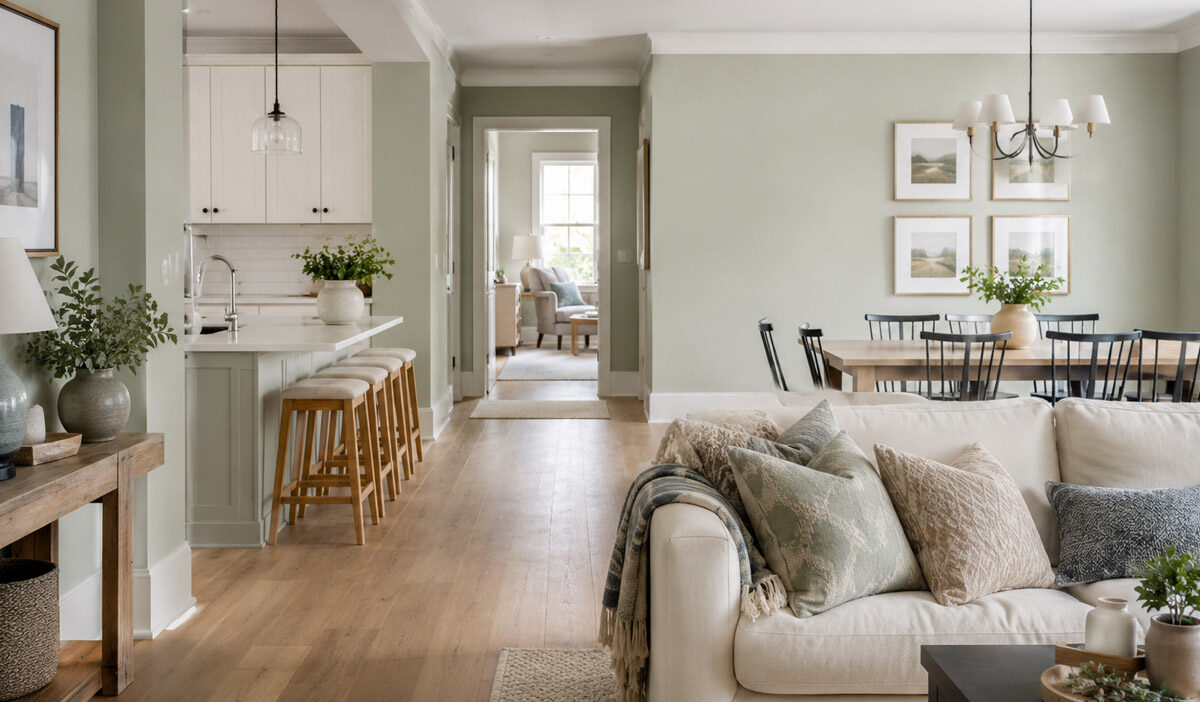
Most homes don’t feel disjointed because someone picked “bad” colors, explains the WSR Property Management team. They feel disjointed because each room was chosen in isolation, with no thought given to what happens the moment you walk from one space into the next. A cohesive color flow isn’t about painting every wall the same shade. It’s about treating your home as one continuous visual journey, with rules that carry the eye smoothly from the front hall to the back bedroom.
Start With One Neutral That Does The Heavy Lifting
A cohesive home generally has a backbone color, often a neutral – a warm greige, a soft white, a putty, a light taupe. It usually has the most wall space, meaning it’s probably what will be in your main living areas as you open off other rooms. It’s not a standout shade. And that’s exactly the point. It gives your personality colors somewhere to land that isn’t busy or overwhelming.
It’s important to get this “backbone” color down before you make any other decisions. No accent walls, furniture, or art choices come next. They’re compared to this first decision, then locked down, so that the backbone color stabilizes your home’s palette. Skip this step, and you waste a lot of time and energy trying to carry samples from room to room, match them over and over, or live with things that are ‘off’.
Adjust For Light Before You Adjust For Taste
A color that looks perfect in a bright, south-facing living room can turn flat and lifeless in a north-facing room down the hall. Natural light changes color temperature more than most homeowners account for. The fix isn’t a different color – it’s a different depth of the same color. Go a shade lighter in darker rooms, a shade deeper in brighter ones, and the palette stays unified even as it adapts to each room’s light.
Getting this right across an entire home, especially one with multiple exposures and several transition zones, is a bigger job than most people expect once they’re several rooms in. It’s why a lot of homeowners bring in a professional Domestic decorating service partway through planning, to keep proportions, undertones, and finishes consistent across a project that’s easy to get right in one room and wrong across ten.
Use Proportion, Not Repetition, To Create Rhythm
The usual guidance is “just use the same color everywhere.” That’s not quite accurate, nor is it how the pros actually handle it. The better rule is the 60-30-10 rule: 60% dominant neutral, 30% secondary supporting tone, 10% accent. Stick to that ratio in every room, but let the accent percentage alter by space.
In your living room, that might mean the accent shows up as an entire feature wall. In the bedroom, it may only pop up in cushions or a painting. The wall color shifts, but the thread doesn’t. Your eye catches the repeated accent and perceives the whole home as one unit, even though not a room is the same color.
Match Undertones, Not Paint Names
This is typically the stage where most DIY color plans begin to fall apart. For example, two paints can be of the same category of “sage green” with the potential to clash badly if one of them has a yellow undertone while the other has a blue undertone. In this scenario, it is the undertones that are responsible for a room giving off a wrong vibe alongside another room, rather than the actual shade of the color.
Before making your final decision, select potential colors for rooms that are next to each other and place them side by side under similar sources of light. You cannot rely on the particular names of the swatches found on a paint can. Paint a section on the wall itself, check it during the day and then at night, and compare it with the sample from the neighboring room. Colors for adjacent rooms only work if their undertones gel.
Treat Hallways And Staircases As Bridges, Not Afterthoughts
Transition zones are often overlooked but shouldn’t be. Hallways and staircases don’t just physically connect rooms, they also connect them visually. A shared trim color that runs throughout the home does a lot of this work quietly – it frames every doorway with the same anchor, no matter what’s happening on the walls around it.
For the hallway itself, you want a mid-tone that reads as a natural bridge between whatever colors sit in the rooms on either side. This is also where paint sheen matters more than people expect. A satin finish in a high-traffic transition zone holds up better and reflects light differently than the matte finish you might use in a bedroom, which can shift how the same color reads from room to room.
Color Choices Carry Real Value
None of this is skin deep. Zillow’s 2018 “Paint Colors That Sell” analysis revealed that homes with light-blue bathrooms sold for an average of $5,440 more than expected – confirming that balanced color design isn’t just about the experience of living in a space. It impacts what buyers are prepared to pay, come moving time.
A well-designed home isn’t a happy accident, and it isn’t a demand to paint everything a generic neutral. It’s that neutral backbone, the right accent in the right place, undertones that play nicely, and those transition zones working as bridges rather than gaps. Get that bit of color planning right and the creative, feel-good choices take care of themselves.